Taylor Community Library
Information Architecture Redesign
Project Background: Vanessa Verdun-Morris, Taylor Community Library Director, requested a reorganization and redesign of their website. The motivation for the redesign was to improve the findability of content to assist users in finding information about events and complete key tasks such as searching and reserving content, managing accounts, and locating library hours and contact information. Rather than rewriting the content, the strategy was to reorganize it using information architecture practices.
Projet Goals:
Understand the website usage.
Identify common tasks utilized on the website.
Identify information architecture issues within the site.
Identify the type of individuals who utilize the website, how they use it, and what they look for in terms of information/services.
Scope: The project was completed over 6 weeks.
Objectives included:
Conduct an evaluation of the current site and identify areas where updates and reorganization of information can occur.
Redesign the site emphasizing the information architecture and the ease of finding information for end users.
Action: The existing architecture was reviewed to establish a baseline. To better understand the target audience of the library site, research was performed via remote interviews and a literary review. After conducting interviews and literary research, key themes around library patrons and goals were identified for the site redesign. Personas were then created based on the types of real user groups discovered in customer intereviews. After identifying and prioritizing the functional requirements of the site, a content inventory was conducted followed by a card sort to begin the reorganization process. I proposed a hybrid approach for organizing the content, combining topical and task-oriented top-level content items in an ambiguous classification scheme. This would help promote easier browsing of the site by presenting content in a contextual manner. The sitemap was designed to address the usability concerns as well as streamline the existing structure. Two phases of testing were used to derive the final site map. The first was through Optimal Workshop/Treejack to test the findability of topics within the architecture.
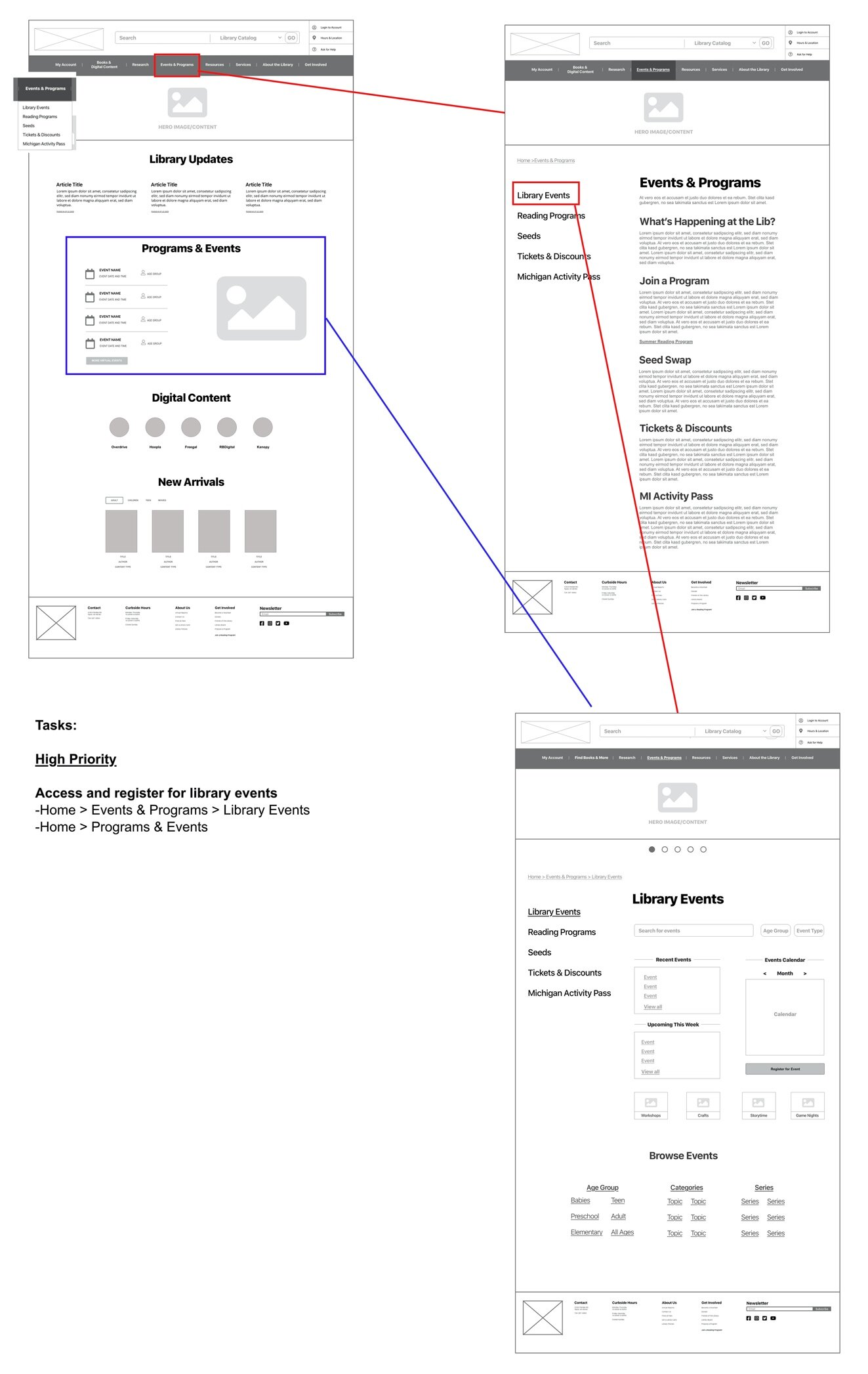
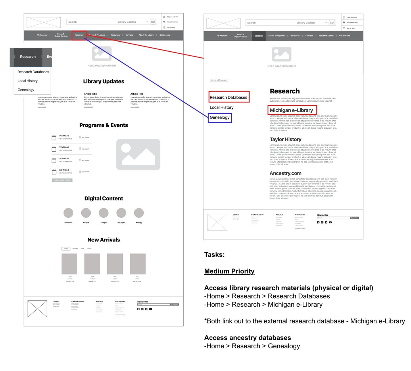
Results: The Treejack study indicated that the proposed navigation structure was effective, but also led to two major revisions. The second phase tested wireframes through Chalkmark. Results were similar, indicating that the overall structure was effective. The header received an update, offering a more robust search feature and the ability for a user to manage their account and access the catalog quickly. The emphasis of the reorganization was on the most important content and high priority tasks a patron will complete. Along with the final sitemap, ten wireframes were designed to satisfy the 12 tasks identified as functional requirements for the redesign.
Lessons Learned: This project provided a chance to conduct an extensive content audit, which is something I did not have formal experience with. I was able to consume large amounts of informatiton and logically separate it by themes. Understanding user groups and the way in which they intend on using the site allowed me to determine the proper ordere of tasks and which entry points would be the most logical. It gave me a whole new appreciation for site navigation and structure and I no longer look at sites the same.
Task Priority
Key themes around library patrons and goals were identified through cutsomer interviews and literary reviews:
Patrons still want physical copies despite using e-readers.
Streaming content is a very commonly used feature.
Databases cause a lot of confusion for patrons.
Library labeling and terminology is often confusing to patrons.
Events are very popular for all ages.
Site must accommodate a wide range of tasks.
“Because content can be consumed so quickly, patrons expect to be able to find and obtain what they are looking for instantly. They don’t want to search for it. They expect instant gratification. We as a library need to make sure that they are able to do that.”
— Kathleen (librarian)
Personas


Testing Protocol
TreeJack
The first phase of testing was through TreeJack. This software is used for tree testing which helped evaluate the findability of topics on the site. Two major revisions were made as a result of this testing:
Moving where a user can sign-up for a library card from “My Account” to “Services.”
More explicit labeling for the “Research” section.
Chalkmark
The second phase tested wireframes through Chalkmark, a software focused on where users would click first on the interface. The following revisions were made as a result of the testing:
Label change from “Find Books & More” to “Books & Digital Content”
Breaking out “Local History” and “Genealogy” into separate pages
Final Sitemap

Workflows


