Meals on Wheels
Interactive Form Design
Project Background: Meals on Wheels America is the leadership organization supporting the more than 5,000 community-based programs across the country that are dedicated to addressing senior isolation and hunger. As a “designer with the municipal government,” I was to create a form that allowed town residents to apply for a meals on wheels service while considering UI/UX patterns and principles.
Goals: Design a form that is easy to understand, navigate, and reduces chances for error.
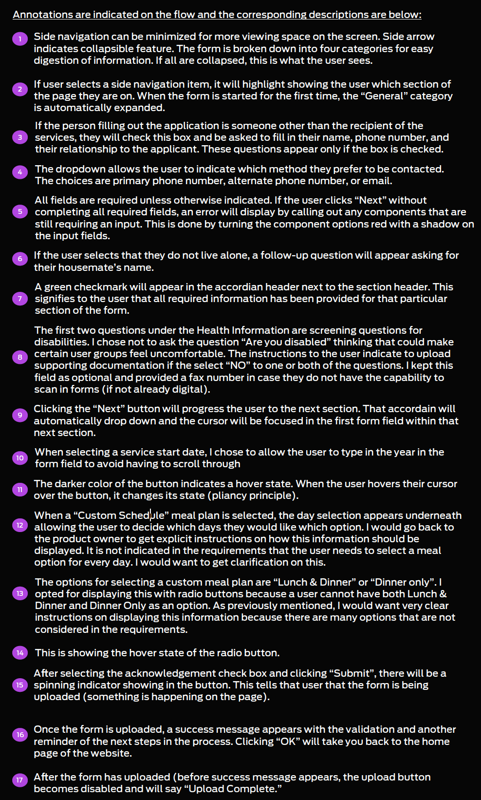
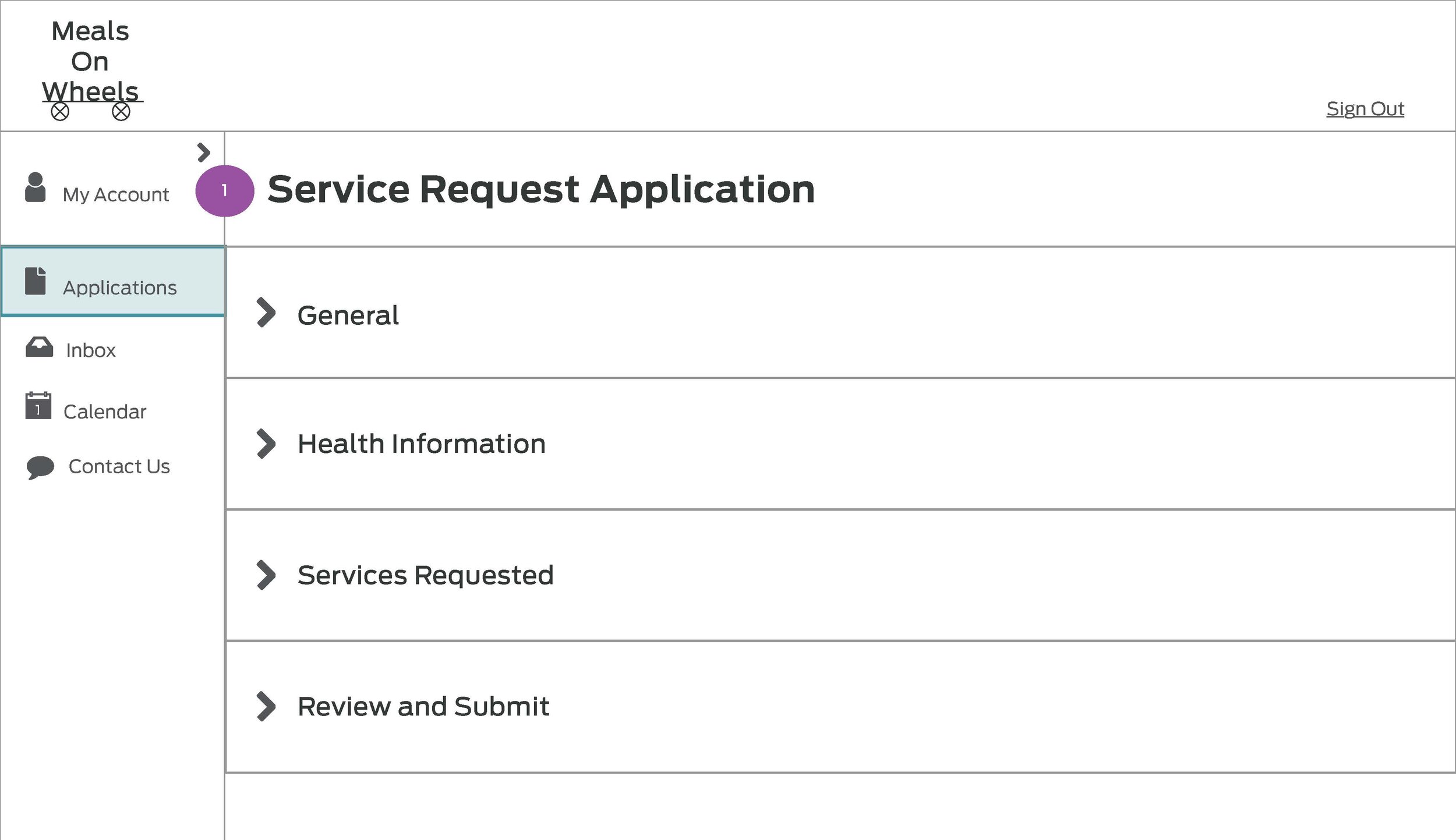
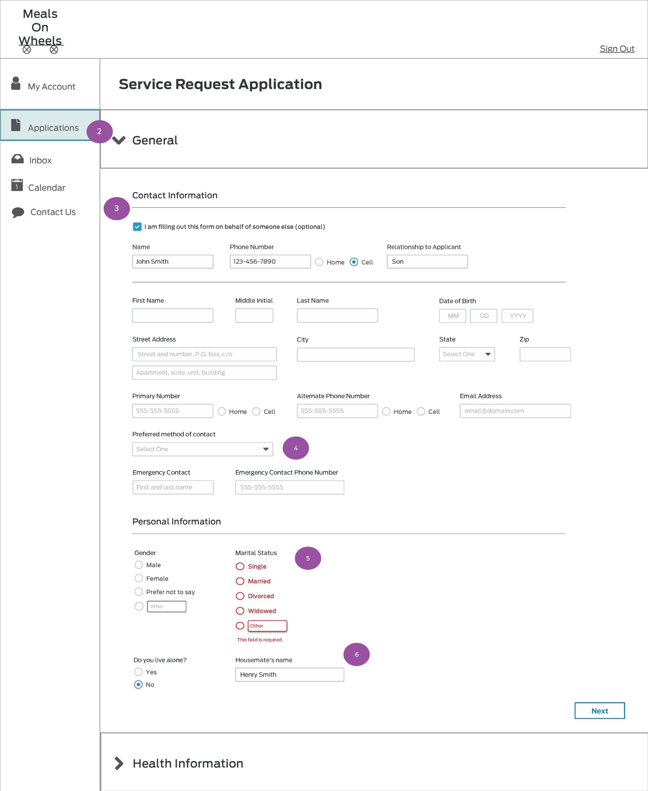
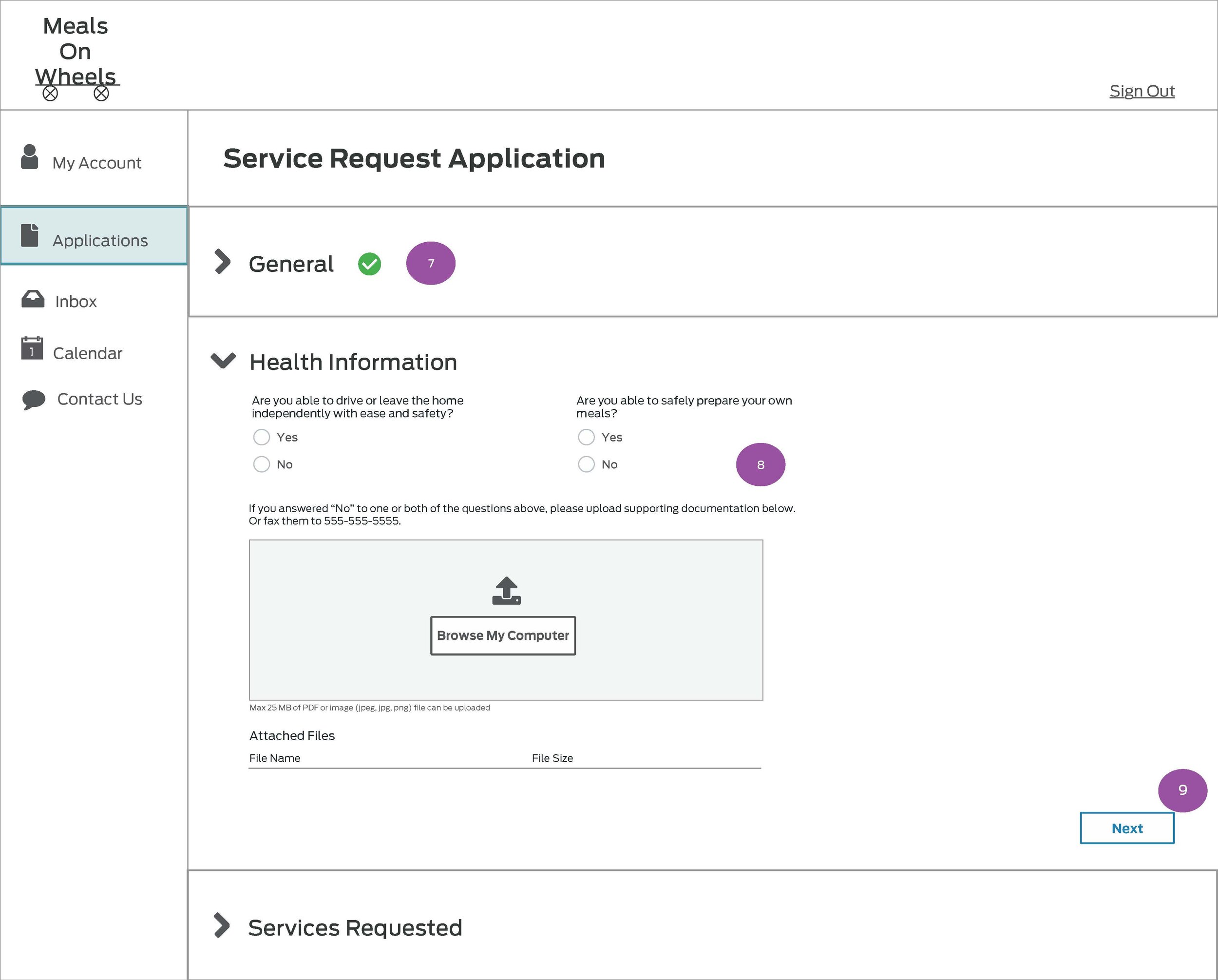
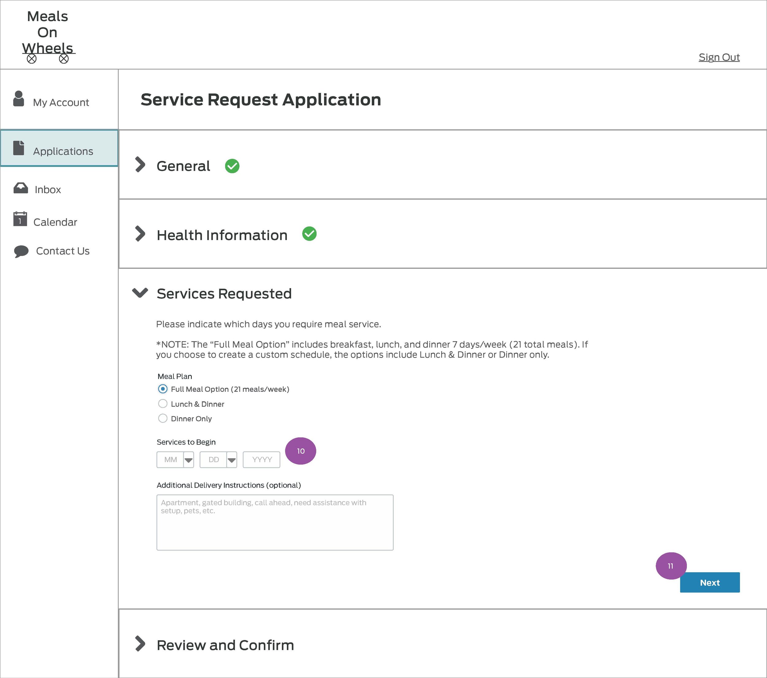
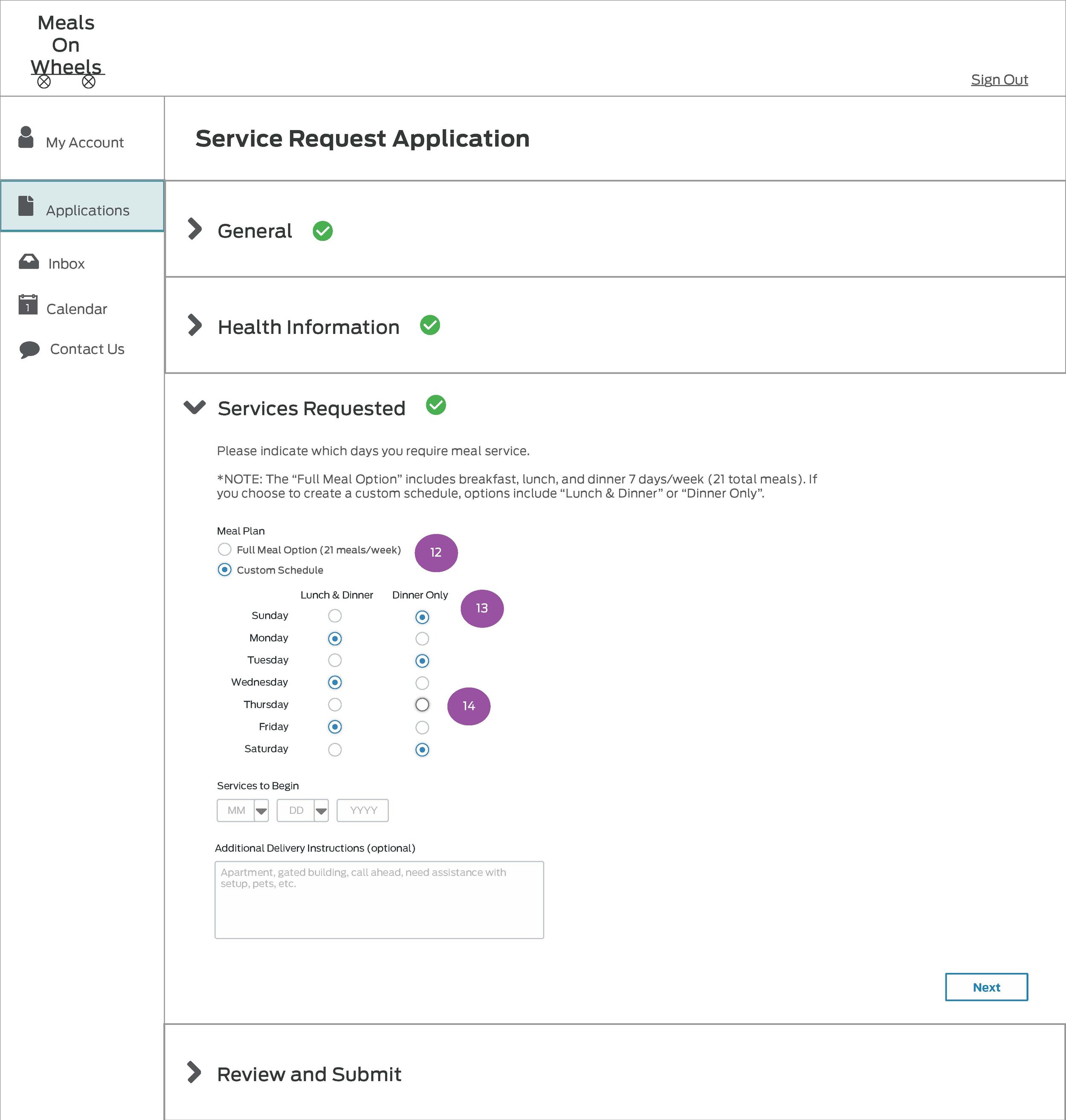
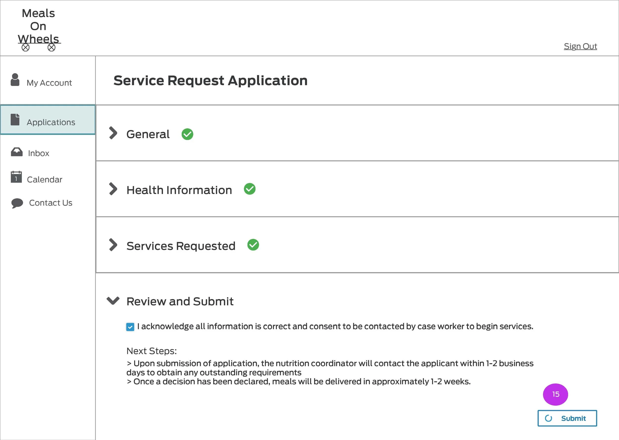
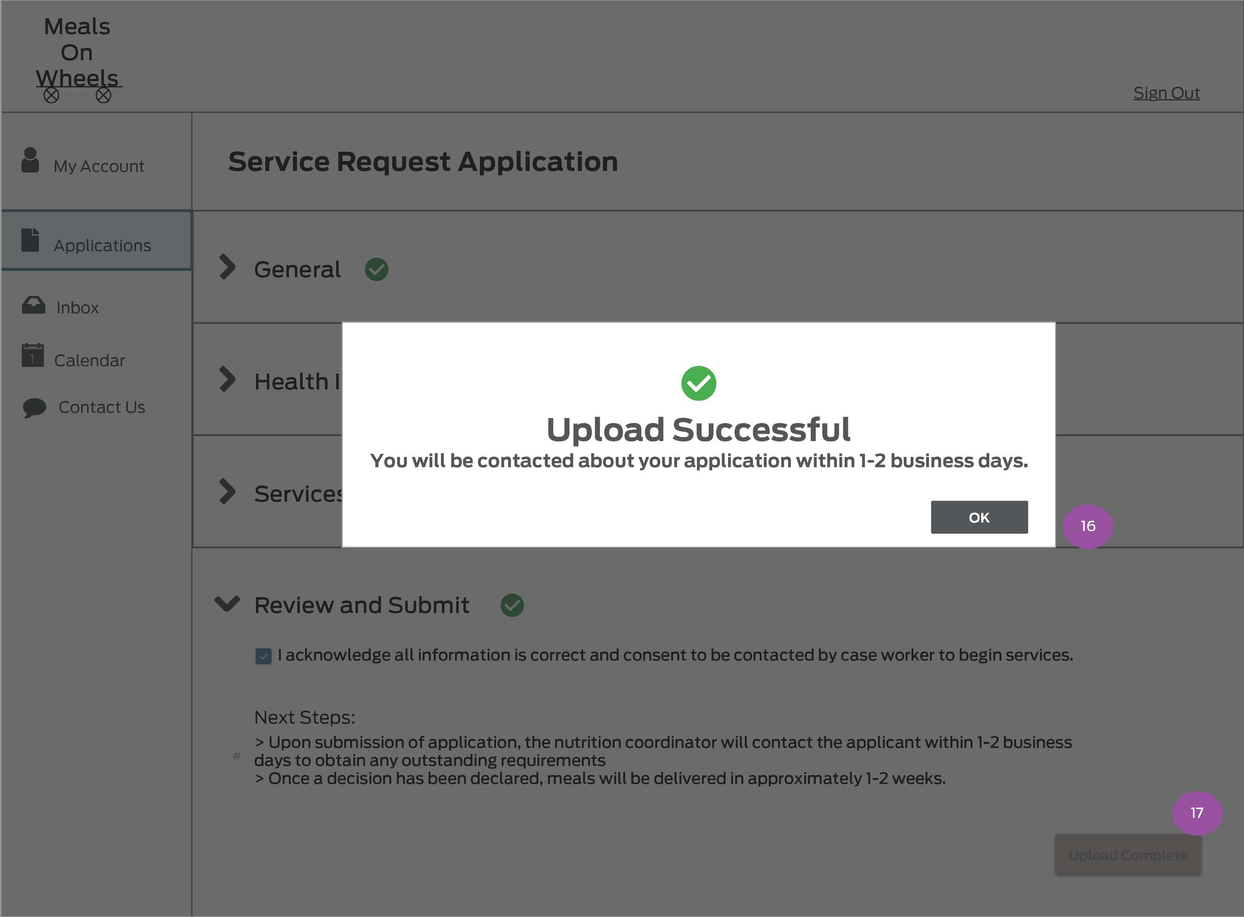
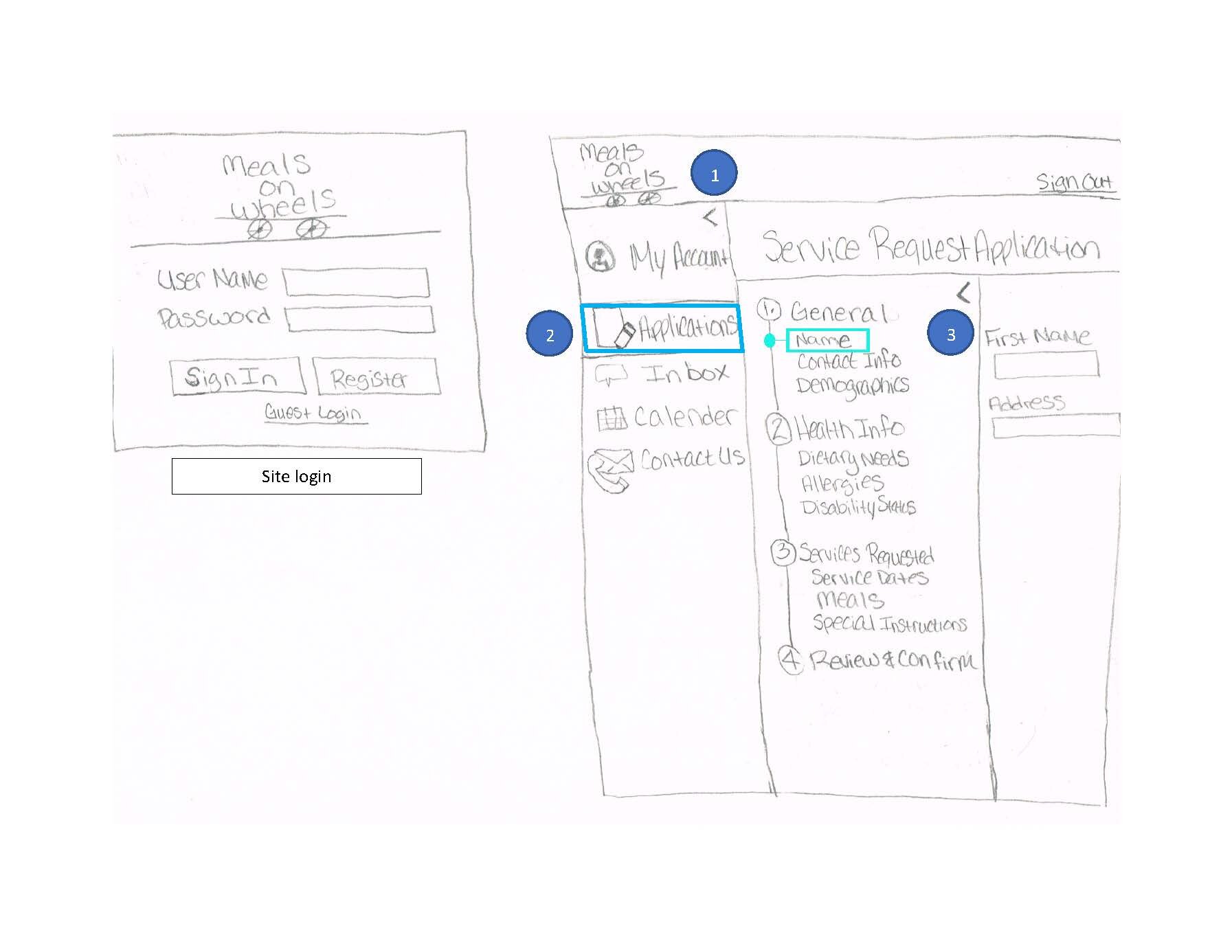
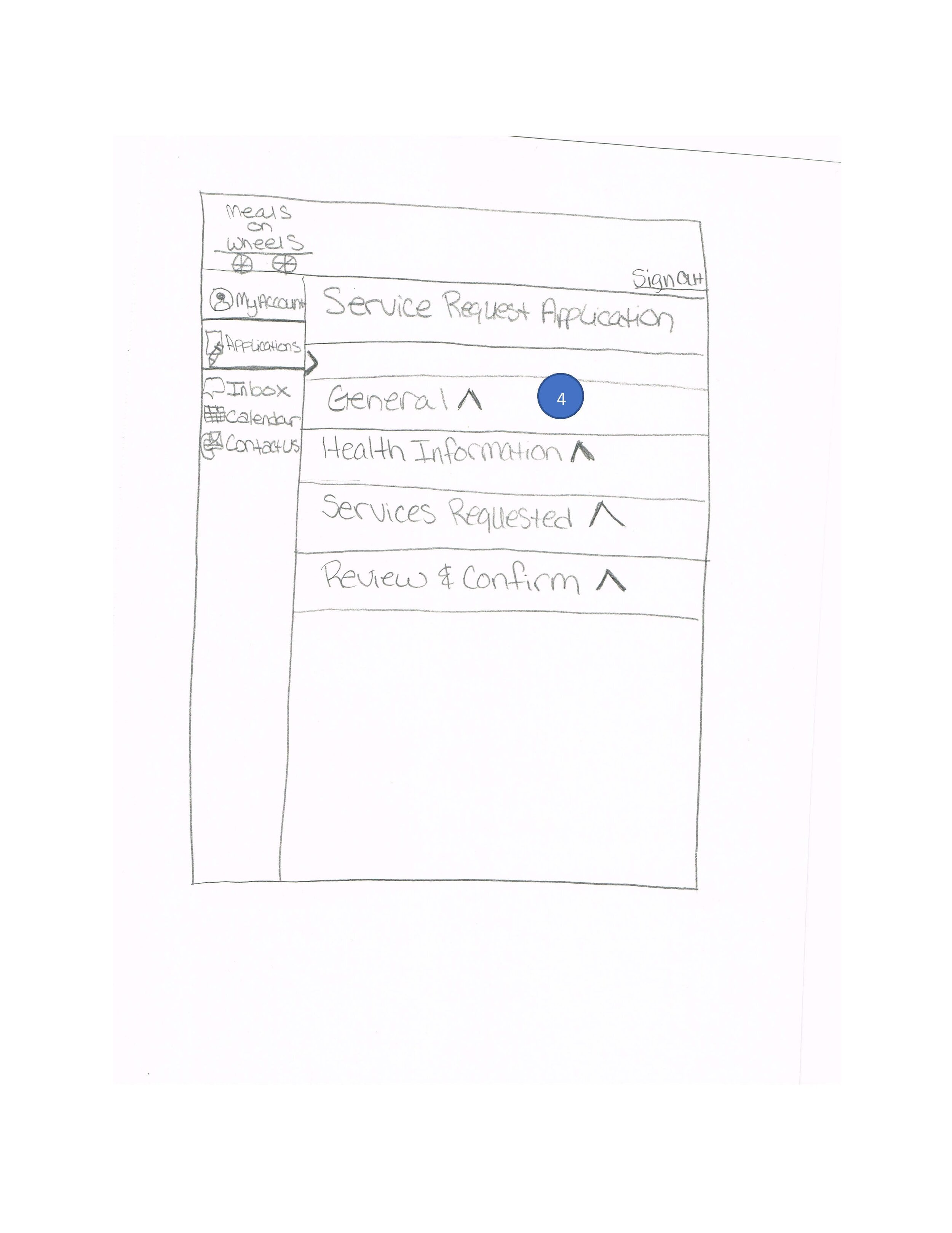
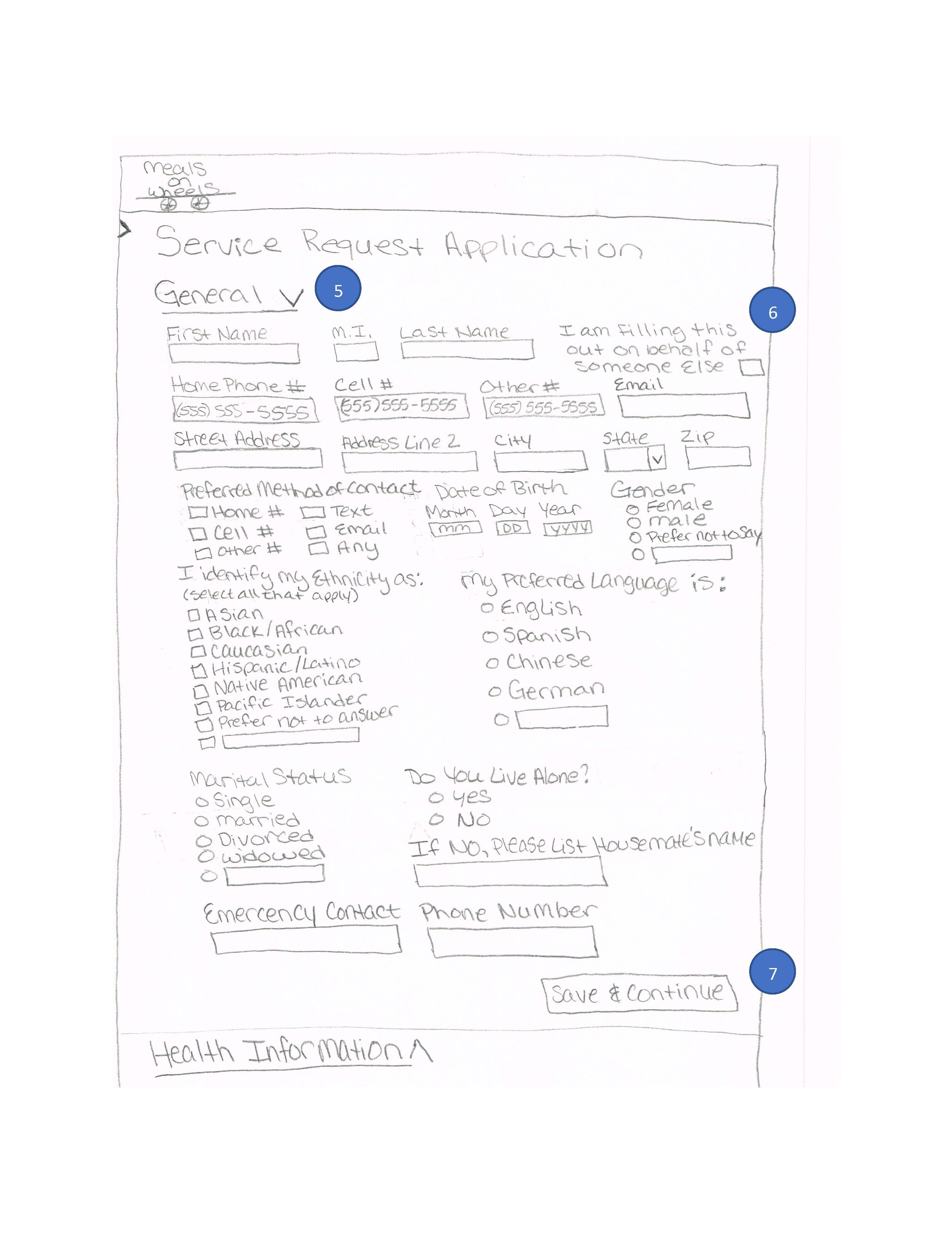
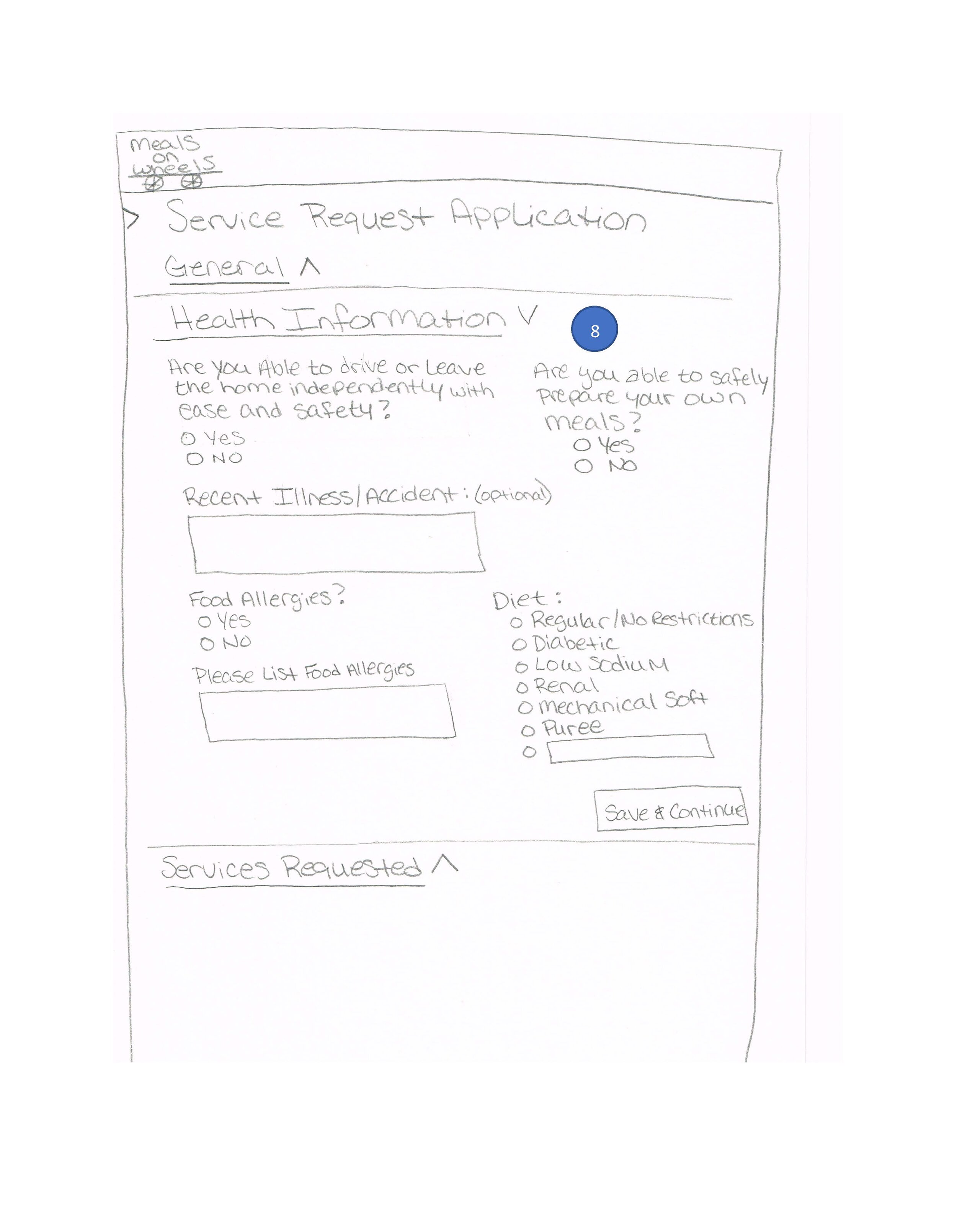
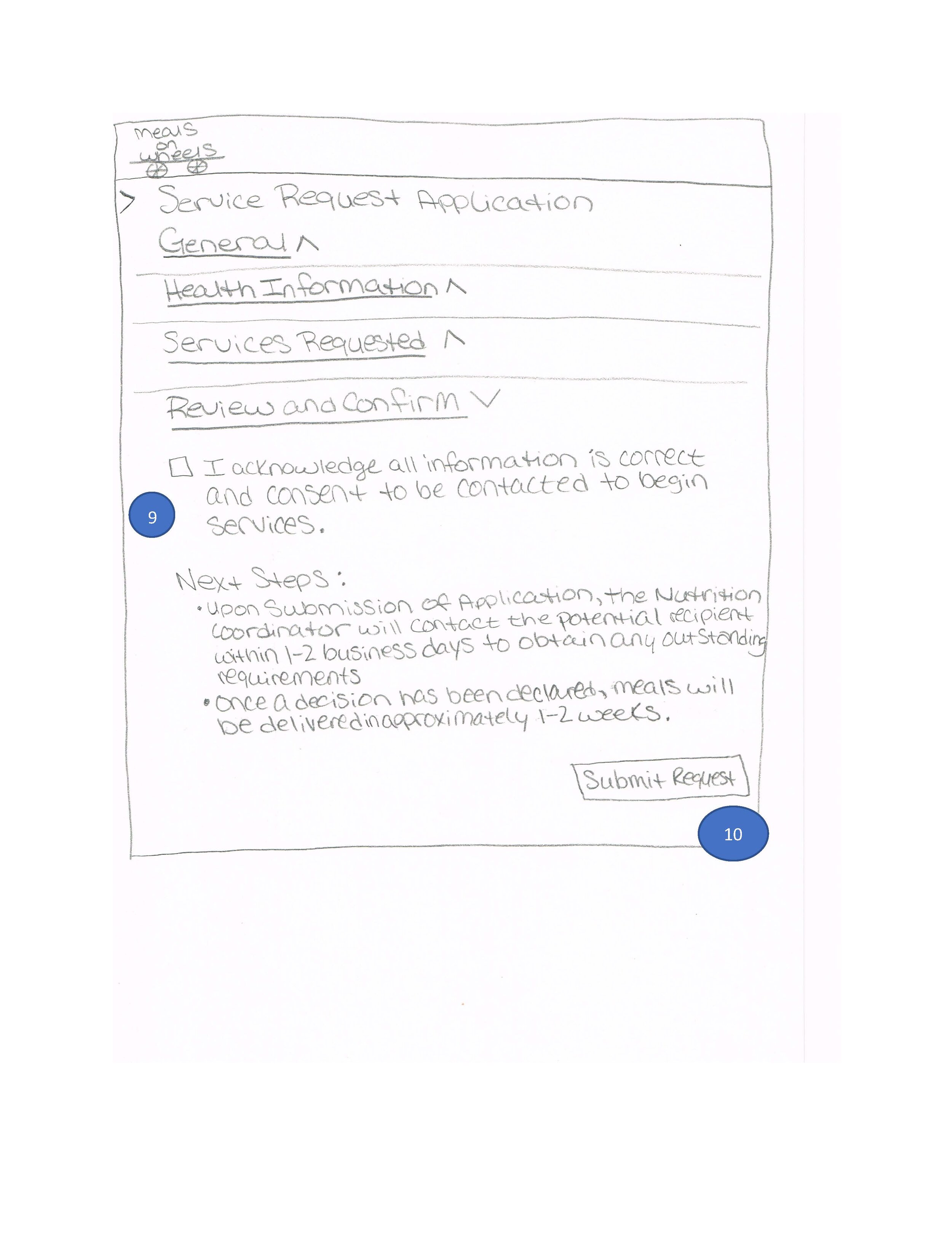
Action: I intended the audience to be of the elderly community and/or suffering from a physical or mental disability. Keeping that in mind, it was very important to pay close attention to consistency and visual hierarchy. Because it’s an application for services, the user is required to input a large amount of information. I broke down the sections into collapsible sections so the information is easily digestible. Once a user finishes one section, they can save and continue to the next one. If they do not have all information at the time of entry, they can save and return to the form at another time. The end-user can also expand a previous section and edit information. The questions are asked in a similar fashion as they may see on many common medical forms.
Results: Annotated sketches and wireframes developed explaining the application workflow. UX/UI patterns such as progress indicators and section headers were utilized.
Lessons Learned: This project helped me learn about scope creep and only delivering what a client is asking for. Assuming additional features are helpful may not be within budget nor something that the client would actually want. Designing forms with sensitive informatiton around age/race/medical history requires thought on WHAT information is truly necessary and WHY it needs to be gathered. Lastly, taking careful consideration for the target audience was a large part of this assignment. Exploring ways to solve for people with vision and/or mobility impairments impacted how the form was developed for a mobile platform. While I didn’t study accessibility until later in my coursework it was a helpful primer for approaching usability concerns.
Sketches
Iteration Changes
Cleaned up the General section to make it more readible/digestible
Added additional signifiers for the user to know when a section is complete
Removed additional side navigation since taking the target population into account with more modern trends
Removed fields that were out of scope
Wireframes
